The Ultimate Python Seaborn Tutorial: Gotta Catch ‘Em All
In this step-by-step Seaborn tutorial, you’ll learn how to use one of Python’s most convenient libraries for data visualization.
For those who’ve tinkered with Matplotlib before, you may have wondered, “why does it take me 10 lines of code just to make a decent-looking histogram?”
Well, if you’re looking for a simpler way to plot attractive charts, then you’ll love Seaborn. We’ll walk you through everything you need to know to get started, and we’ll use a fun Pokémon dataset (which you can download below).
Introduction to Seaborn
Seaborn provides a high-level interface to Matplotlib, a powerful but sometimes unwieldy Python visualization library.
On Seaborn’s official website, they state:
If matplotlib “tries to make easy things easy and hard things possible”, seaborn tries to make a well-defined set of hard things easy too.
We’ve found this to be a pretty good summary of Seaborn’s strengths. In practice, the “well-defined set of hard things” includes:
- Using default themes that are aesthetically pleasing.
- Setting custom color palettes.
- Making attractive statistical plots.
- Easily and flexibly displaying distributions.
- Visualizing information from matrices and DataFrames.
Those last three points are why Seaborn is our tool of choice for Exploratory Analysis. It makes it very easy to “get to know” your data quickly and efficiently.
However, Seaborn is a complement, not a substitute, for Matplotlib. There are some tweaks that still require Matplotlib, and we’ll cover how to do that as well.
How to Learn Seaborn, the Self-Starter Way:
While Seaborn simplifies data visualization in Python, it still has many features. Therefore, the best way to learn Seaborn is to learn by doing.
- First, understand the basics and paradigms of the library.
- Each library approaches data visualization differently, so it’s important to understand how Seaborn “thinks about” the problem.
- Then, fire up a dataset for practice.
- Learning in context is the best way to master a new skill quickly.
- Finally, refer to galleries to spark ideas and documentation to customize your charts.
- Since you’ve already learned the library’s paradigms and had some hands-on practice, you’ll easily find what you need.
This process will give you intuition about what you can do with Seaborn, leaving documentation to serve as further guidance. This is the fastest way to go from zero to proficient.
A quick tip before we begin:
We tried to make this tutorial as streamlined as possible, which means we won’t go into too much detail for any one topic. It’s helpful to have the Seaborn documentation open beside you, in case you want to learn more about a feature.
Seaborn Tutorial Contents
Instead of just showing you how to make a bunch of plots, we’re going to walk through the most important paradigms of the Seaborn library. Along the way, we’ll illustrate each concept with examples.
Here are the steps we’ll cover in this tutorial:
- Installing Seaborn.
- Importing libraries and dataset.
- Seaborn’s plotting functions.
- Scatter Plot
- Customizing with Matplotlib.
- The role of Pandas.
- Box Plot
- Seaborn themes.
- Violin Plot
- Color palettes.
- Swarm Plot
- Overlaying plots.
- Putting it all together.
- Pokédex (mini-gallery).
- Heatmap
- Histogram
- Bar Plot
- Factor Plot
- Density Plot
- Joint Distribution Plot
Step 1: Installing Seaborn.
- Python 3
- Pandas
- Matplotlib
- Seaborn
- Jupyter Notebook (optional, but recommended)
We strongly recommend installing the Anaconda Distribution, which comes with all of those packages. Simply follow the instructions on that download page.
Once you have Anaconda installed, simply start Jupyter (either through the command line or the Navigator app) and open a new notebook
Step 2: Importing libraries and dataset.
Let’s start by importing Pandas, which is a great library for managing relational (i.e. table-format) datasets:
# disable warnings for lecture
import warnings
warnings.filterwarnings('ignore')
# Pandas for managing datasets
import pandas as pd
Next, we’ll import Matplotlib, which will help us customize our plots further.
- Tip: In Jupyter Notebook, you can also include
%matplotlib inlineto display your plots inside your notebook.
# Matplotlib for additional customization
from matplotlib import pyplot as plt
%matplotlib inline
Then, we’ll import the Seaborn library, which is the star of today’s show.
# Seaborn for plotting and styling
import seaborn as sns
Now we’re ready to import our dataset.
- Tip: we gave each of our imported libraries an alias. Later, we can invoke Pandas with
pd, Matplotlib withplt, and Seaborn withsns.
Today, we’ll be using a cool Pokémon dataset (first generation). Here’s the free download:
Dataset for this tutorial.
Once you’ve downloaded the CSV file, you can import it with Pandas.
- Tip: The argument
index_col=0simply means we’ll treat the first column of the dataset as the ID column.
# Read dataset
df = pd.read_csv('Pokemon.csv', index_col=0)
# Display first 5 observations
df.head()
| Name | Type 1 | Type 2 | Total | HP | Attack | Defense | Sp. Atk | Sp. Def | Speed | Stage | Legendary | |
|---|---|---|---|---|---|---|---|---|---|---|---|---|
| # | ||||||||||||
| 1 | Bulbasaur | Grass | Poison | 318 | 45 | 49 | 49 | 65 | 65 | 45 | 1 | False |
| 2 | Ivysaur | Grass | Poison | 405 | 60 | 62 | 63 | 80 | 80 | 60 | 2 | False |
| 3 | Venusaur | Grass | Poison | 525 | 80 | 82 | 83 | 100 | 100 | 80 | 3 | False |
| 4 | Charmander | Fire | NaN | 309 | 39 | 52 | 43 | 60 | 50 | 65 | 1 | False |
| 5 | Charmeleon | Fire | NaN | 405 | 58 | 64 | 58 | 80 | 65 | 80 | 2 | False |
Step 3: Seaborn’s plotting functions.
One of Seaborn’s greatest strengths is its diversity of plotting functions. For instance, making a scatter plot is just one line of code using the lmplot() function.
There are two ways you can do so.
- The first way (recommended) is to pass your DataFrame to the
data=argument, while passing column names to the axes arguments,x=andy=. - The second way is to directly pass in Series of data to the axes arguments.
For example, let’s compare the Attack and Defense stats for our Pokémon:
# Recommended way
sns.lmplot(x='Attack', y='Defense', data=df)
<seaborn.axisgrid.FacetGrid at 0x7fd6c805d910>
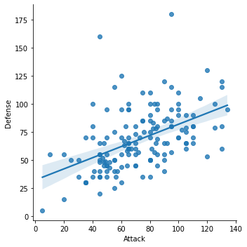
By the way, Seaborn doesn’t have a dedicated scatter plot function, which is why you see a diagonal line. We actually used Seaborn’s function for fitting and plotting a regression line.
Thankfully, each plotting function has several useful options that you can set. Here’s how we can tweak the lmplot():
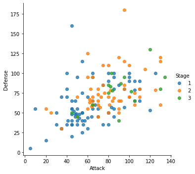
- First, we’ll set
fit_reg=Falseto remove the regression line, since we only want a scatter plot. - Then, we’ll set
hue='Stage'to color our points by the Pokémon’s evolution stage. This hue argument is very useful because it allows you to express a third dimension of information using color.
# Scatterplot arguments
sns.lmplot(x='Attack', y='Defense', data=df,
           fit_reg=False, # No regression line
           hue='Stage')   # Color by evolution stage
<seaborn.axisgrid.FacetGrid at 0x7fd71abc7130>
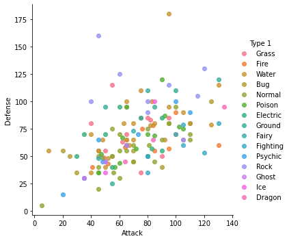
# Scatterplot arguments
sns.lmplot(x='Attack', y='Defense', data=df,
           fit_reg=False, # No regression line
           hue='Type 1')   # Color by evolution stage
<seaborn.axisgrid.FacetGrid at 0x7fd719a289d0>
Looking better, but we can improve this scatter plot further. For example, all of our Pokémon have positive Attack and Defense values, yet our axes limits fall below zero.
Let’s see how we can fix that…
Step 4: Customizing with Matplotlib.
Remember, Seaborn is a high-level interface to Matplotlib. From our experience, Seaborn will get you most of the way there, but you’ll sometimes need to bring in Matplotlib.
Setting your axes limits is one of those times, but the process is pretty simple:
- First, invoke your Seaborn plotting function as normal.
- Then, invoke Matplotlib’s customization functions. In this case, we’ll use its
ylim()andxlim()functions.
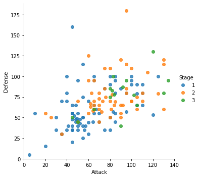
Here’s our new scatter plot with sensible axes limits:
# Plot using Seaborn
sns.lmplot(x='Attack', y='Defense', data=df,
           fit_reg=False,
           hue='Stage')

# Tweak using Matplotlib
plt.ylim(0, None)
plt.xlim(0, None)
(0.0, 140.45)
Step 5: The role of Pandas.
Even though this is a Seaborn tutorial, Pandas actually plays a very important role. You see, Seaborn’s plotting functions benefit from a base DataFrame that’s reasonably formatted.
For example, let’s say we wanted to make a box plot for our Pokémon’s combat stats:
plt.figure(figsize = (8, 8))

# Boxplot
sns.boxplot(data=df)
<AxesSubplot:>
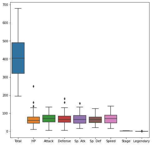
Well, that’s a reasonable start, but there are some columns we’d probably like to remove:
- We can remove the Total since we have individual stats.
- We can remove the Stage and Legendary columns because they aren’t combat stats.
In turns out that this isn’t easy to do within Seaborn alone. Instead, it’s much simpler to pre-format your DataFrame.
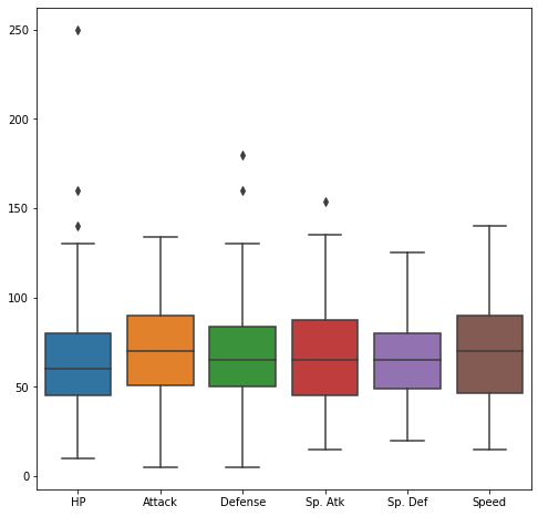
Let’s create a new DataFrame called stats_df that only keeps the stats columns:
plt.figure(figsize = (8, 8))

# Pre-format DataFrame
stats_df = df.drop(['Total', 'Stage', 'Legendary'], axis=1)

# New boxplot using stats_df
sns.boxplot(data=stats_df)
<AxesSubplot:>
Step 6: Seaborn themes.
Another advantage of Seaborn is that it comes with decent style themes right out of the box. The default theme is called ‘darkgrid’.
Next, we’ll change the theme to ‘whitegrid’ while making a violin plot.
- Violin plots are useful alternatives to box plots.
- They show the distribution (through the thickness of the violin) instead of only the summary statistics.
For example, we can visualize the distribution of Attack by Pokémon’s primary type:
plt.figure(figsize = (12, 12))

# Set theme
sns.set_style('whitegrid')

# Violin plot
sns.violinplot(x='Type 1', y='Attack', data=df)
<AxesSubplot:xlabel='Type 1', ylabel='Attack'>
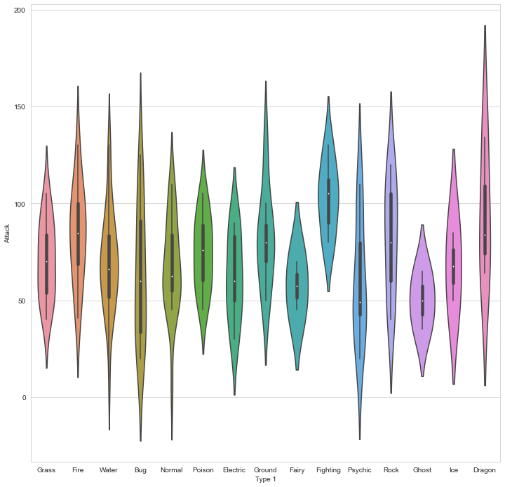
As you can see, Dragon types tend to have higher Attack stats than Ghost types, but they also have greater variance.
Now, Pokémon fans might find something quite jarring about that plot: The colors are nonsensical. Why is the Grass type colored pink or the Water type colored orange? We must fix this!
Step 7: Color palettes.
Fortunately, Seaborn allows us to set custom color palettes. We can simply create an ordered Python list of color hex values.
Let’s use Bulbapedia to help us create a new color palette:
pkmn_type_colors = ['#78C850',  # Grass
                    '#F08030',  # Fire
                    '#6890F0',  # Water
                    '#A8B820',  # Bug
                    '#A8A878',  # Normal
                    '#A040A0',  # Poison
                    '#F8D030',  # Electric
                    '#E0C068',  # Ground
                    '#EE99AC',  # Fairy
                    '#C03028',  # Fighting
                    '#F85888',  # Psychic
                    '#B8A038',  # Rock
                    '#705898',  # Ghost
                    '#98D8D8',  # Ice
                    '#7038F8',  # Dragon
                   ]
Wonderful. Now we can simply use the palette= argument to recolor our chart.
plt.figure(figsize = (10, 10))

# Violin plot with Pokemon color palette
sns.violinplot(x='Type 1', y='Attack', data=df,
               palette=pkmn_type_colors) # Set color palette
<AxesSubplot:xlabel='Type 1', ylabel='Attack'>
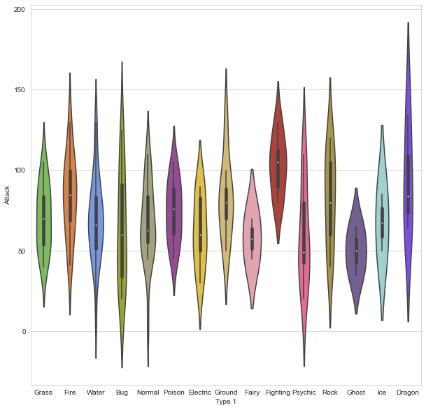
Much better!
Violin plots are great for visualizing distributions. However, since we only have 151 Pokémon in our dataset, we may want to simply display each point.
That’s where the swarm plot comes in. This visualization will show each point, while “stacking” those with similar values:
plt.figure(figsize = (10, 10))

# Swarm plot with Pokemon color palette
sns.swarmplot(x='Type 1', y='Attack', data=df,
              palette=pkmn_type_colors)
<AxesSubplot:xlabel='Type 1', ylabel='Attack'>
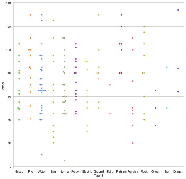
That’s handy, but can’t we combine our swarm plot and the violin plot? After all, they display similar information, right?
Step 8: Overlaying plots.
The answer is yes.
It’s pretty straightforward to overlay plots using Seaborn, and it works the same way as with Matplotlib. Here’s what we’ll do:
- First, we’ll make our figure larger using Matplotlib.
- Then, we’ll plot the violin plot. However, we’ll set
inner=Noneto remove the bars inside the violins. - Next, we’ll plot the swarm plot. This time, we’ll make the points black so they pop out more.
- Finally, we’ll set a title using Matplotlib.
# Set figure size with matplotlib
plt.figure(figsize=(10,6))

# Create plot
sns.violinplot(x='Type 1',
               y='Attack',
               data=df,
               inner=None, # Remove the bars inside the violins
               palette=pkmn_type_colors)

sns.swarmplot(x='Type 1',
              y='Attack',
              data=df,
              color='k', # Make points black
              alpha=0.7) # and slightly transparent

# Set title with matplotlib
plt.title('Attack by Type')
Text(0.5, 1.0, 'Attack by Type')
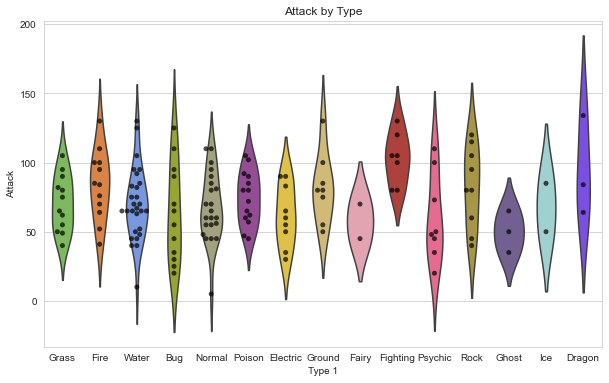
Awesome, now we have a pretty chart that tells us how Attack values are distributed across different Pokémon types. But what it we want to see all of the other stats as well?
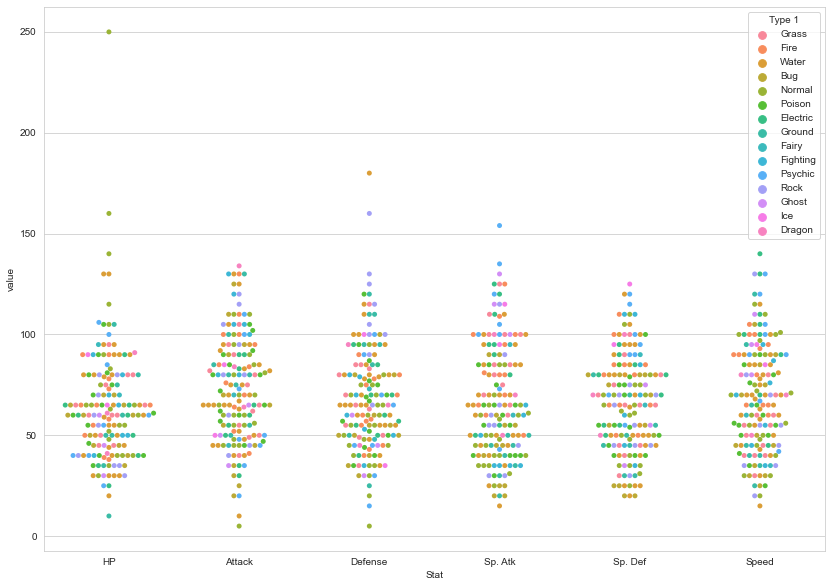
Step 9: Putting it all together.
Well, we could certainly repeat that chart for each stat. But we can also combine the information into one chart… we just have to do some data wrangling with Pandas beforehand.
First, here’s a reminder of our data format:
stats_df.head()
| Name | Type 1 | Type 2 | HP | Attack | Defense | Sp. Atk | Sp. Def | Speed | |
|---|---|---|---|---|---|---|---|---|---|
| # | |||||||||
| 1 | Bulbasaur | Grass | Poison | 45 | 49 | 49 | 65 | 65 | 45 |
| 2 | Ivysaur | Grass | Poison | 60 | 62 | 63 | 80 | 80 | 60 |
| 3 | Venusaur | Grass | Poison | 80 | 82 | 83 | 100 | 100 | 80 |
| 4 | Charmander | Fire | NaN | 39 | 52 | 43 | 60 | 50 | 65 |
| 5 | Charmeleon | Fire | NaN | 58 | 64 | 58 | 80 | 65 | 80 |
As you can see, all of our stats are in separate columns. Instead, we want to “melt” them into one column.
To do so, we’ll use Pandas’s melt() function. It takes 3 arguments:
- First, the DataFrame to melt.
- Second, ID variables to keep (Pandas will melt all of the other ones).
- Finally, a name for the new, melted variable.
Here’s the output:
# Melt DataFrame
melted_df = pd.melt(stats_df,
                    id_vars=["Name", "Type 1", "Type 2"], # Variables to keep
                    var_name="Stat") # Name of melted variable
melted_df.sort_values('Name').head(10)
| Name | Type 1 | Type 2 | Stat | value | |
|---|---|---|---|---|---|
| 364 | Abra | Psychic | NaN | Defense | 15 |
| 213 | Abra | Psychic | NaN | Attack | 20 |
| 817 | Abra | Psychic | NaN | Speed | 90 |
| 666 | Abra | Psychic | NaN | Sp. Def | 55 |
| 515 | Abra | Psychic | NaN | Sp. Atk | 105 |
| 62 | Abra | Psychic | NaN | HP | 25 |
| 443 | Aerodactyl | Rock | Flying | Defense | 65 |
| 594 | Aerodactyl | Rock | Flying | Sp. Atk | 60 |
| 745 | Aerodactyl | Rock | Flying | Sp. Def | 75 |
| 292 | Aerodactyl | Rock | Flying | Attack | 105 |
All 6 of the stat columns have been “melted” into one, and the new Stat column indicates the original stat (HP, Attack, Defense, Sp. Attack, Sp. Defense, or Speed). For example, it’s hard to see here, but Bulbasaur now has 6 rows of data.
In fact, if you print the shape of these two DataFrames…
print( stats_df.shape )
print( melted_df.shape )
(151, 9)
(906, 5)
…you’ll find that melted_df has 6 times the number of rows as stats_df.
Now we can make a swarm plot with melted_df.
- But this time, we’re going to set
x='Stat'andy='value'so our swarms are separated by stat. - Then, we’ll set
hue='Type 1'to color our points by the Pokémon type.
plt.figure(figsize=(14,10))

# Swarmplot with melted_df
sns.swarmplot(x='Stat', y='value', data=melted_df,
              hue='Type 1')
<AxesSubplot:xlabel='Stat', ylabel='value'>
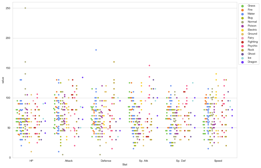
Finally, let’s make a few final tweaks for a more readable chart:
- Enlarge the plot.
- Separate points by hue using the argument
split=True. - Use our custom Pokemon color palette.
- Adjust the y-axis limits to end at 0.
- Place the legend to the right.
# 1. Enlarge the plot
plt.figure(figsize=(14,10))

sns.swarmplot(x='Stat',
              y='value',
              data=melted_df,
              hue='Type 1',
              split=True, # 2. Separate points by hue
              palette=pkmn_type_colors) # 3. Use Pokemon palette

# 4. Adjust the y-axis
plt.ylim(0, 260)

# 5. Place legend to the right
plt.legend(bbox_to_anchor=(1, 1), loc=2)
<matplotlib.legend.Legend at 0x7fd6f8a04160>
Step 10: Pokédex (mini-gallery).
We’re going to conclude this tutorial with a few quick-fire data visualizations, just to give you a sense of what’s possible with Seaborn.
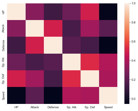
10.1 - Heatmap
Heatmaps help you visualize matrix-like data.
plt.figure(figsize=(8,6))

# Calculate correlations
corr = stats_df.corr()

# Heatmap
sns.heatmap(corr)
<AxesSubplot:>
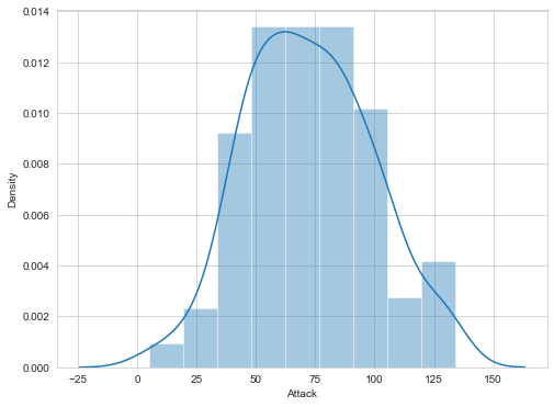
10.2 - Histogram
Histograms allow you to plot the distributions of numeric variables.
plt.figure(figsize=(8,6))

# Distribution Plot (a.k.a. Histogram)
sns.distplot(df.Attack)
<AxesSubplot:xlabel='Attack', ylabel='Density'>
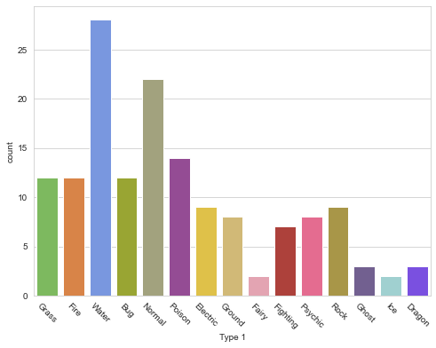
10.3 - Bar Plot
Bar plots help you visualize the distributions of categorical variables.
plt.figure(figsize=(8,6))

# Count Plot (a.k.a. Bar Plot)
sns.countplot(x='Type 1', data=df, palette=pkmn_type_colors)

# Rotate x-labels
plt.xticks(rotation=-45)
(array([ 0,  1,  2,  3,  4,  5,  6,  7,  8,  9, 10, 11, 12, 13, 14]),
 [Text(0, 0, 'Grass'),
  Text(1, 0, 'Fire'),
  Text(2, 0, 'Water'),
  Text(3, 0, 'Bug'),
  Text(4, 0, 'Normal'),
  Text(5, 0, 'Poison'),
  Text(6, 0, 'Electric'),
  Text(7, 0, 'Ground'),
  Text(8, 0, 'Fairy'),
  Text(9, 0, 'Fighting'),
  Text(10, 0, 'Psychic'),
  Text(11, 0, 'Rock'),
  Text(12, 0, 'Ghost'),
  Text(13, 0, 'Ice'),
  Text(14, 0, 'Dragon')])
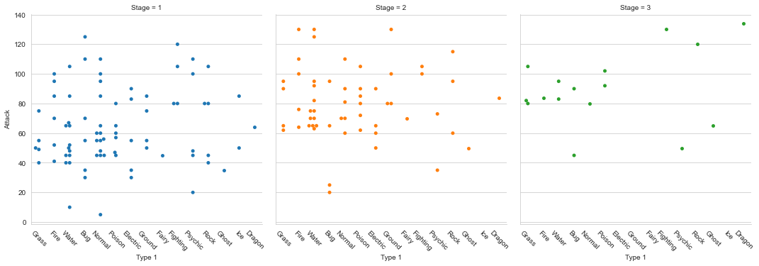
10.4 - Factor Plot
Factor plots make it easy to separate plots by categorical classes.
# Factor Plot
g = sns.factorplot(x='Type 1',
                   y='Attack',
                   data=df,
                   hue='Stage',  # Color by stage
                   col='Stage',  # Separate by stage
                   kind='swarm') # Swarmplot

# Rotate x-axis labels
g.set_xticklabels(rotation=-45)

# Doesn't work because only rotates last plot
# plt.xticks(rotation=-45)
<seaborn.axisgrid.FacetGrid at 0x7fd729325c40>
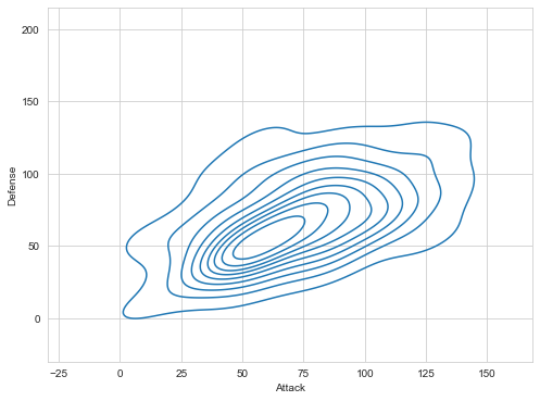
10.5 - Density Plot
Density plots display the distribution between two variables.
plt.figure(figsize=(8,6))

# Density Plot
sns.kdeplot(df.Attack, df.Defense)
<AxesSubplot:xlabel='Attack', ylabel='Defense'>
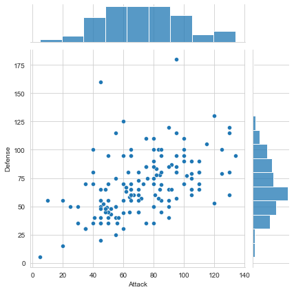
10.6 - Joint Distribution Plot
Joint distribution plots combine information from scatter plots and histograms to give you detailed information for bi-variate distributions.
plt.figure(figsize=(8,6))

# Joint Distribution Plot
sns.jointplot(x='Attack', y='Defense', data=df)
<seaborn.axisgrid.JointGrid at 0x7fd708a60f70>


<Figure size 576x432 with 0 Axes>
Congratulations… you’ve made it to the end of this Python Seaborn tutorial!
We’ve just concluded a tour of key Seaborn paradigms and showed you many examples along the way. Feel free to use this page along with the official Seaborn gallery as references for your projects going forward.